Now that the new UI has come to fruition, what do you all think of it? I personally can’t stand it because I used to use compact mode or whatever you would call it for my games where they would basically be in a detailed format but quite a bit larger than the sidebar with the small details and icons. Also I can handle change, that’s not the issue, the new one looks kind of nice, but the large images of games you have to scroll through makes it more tedious to find out which games you want to play or even have installed. Being able to tell which games were installed and which ones aren’t is a nightmare. It’s impossible to see the download button especially on white backgrounds. It seems until valve gives an option, if that will will ever happen, to choose the older steam UI, I will basically either have to get used to it or just rely on the side bar which is not great either but I will take it over the large game images. If there is a patch or something to fix this or a certain skin for steam to revert it’s current state to an old one, please let me know. I don’t want to use files from someone randomly off the internet because that can definitely not be trusted. Never know what your really getting. If there was a way to get the compact mode as I was describing earlier or if someone can correct me on the name go ahead, then I would have no problem with the new UI for the most part. I know you can change the size of the image, but that doesn’t fix the problem. Getting rid of the different view modes was a really awful choice. Getting rid of customizable features is never a good idea. So many people are complaining about the new UI and I can see why. If it ain’t broke, don’t fix it. At least give an option to use the old UI. Then everyone wins. I’m not even really sure which features are new. In order to even find out how to change the image size you have to go into settings. That makes no sense. There should just be an option right on the UI to change it, like the old steam had. It baffles me why valve thought this was a good idea. Were people not giving input on the beta? That would have been the time to tell valve that it’s a horrible idea to change the UI, or at least changing it quite drastically. That’s enough of my rant. What do you all think?
https://206.81.1.216/t/valve-news-software-hardware-linux-beyond/17517/24?u=coralinecastell
I think it’s doodoo! 
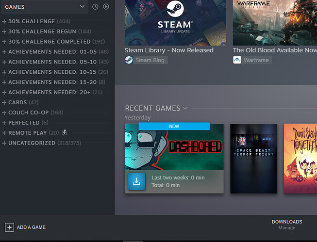
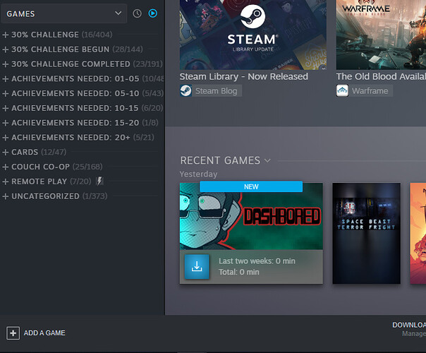
There is a button to restrict the library to only show you games which are ‘ready to play’ meaning they are installed on the machine.
Picture being uploaded shortly to clarify what I mean.
The little blue play button next to the dropdown is what you click on.
As a side note nobody can judge me for my choices of categories.. I am still working on my entire library 30%'d challenge.
You can’t be serious.
You could select multiple titles at once just fine before. You just, you know, selected multiple titles and assigned them all categories. They used the standard “square in checkbox” to indicate if only a subset of the collection was put into a given category.
As far as I can tell, they have removed the ability to easily set multiple categories, which is what I typically do. Say I finish a game as I did today (.projekt). Now I want to file it away so I can find it again even if I don’t remember the name. So I want to put it into several categories: puzzle, length: 2-6 hours, perspective: isometric, perspective: forced, etc.. I used to be able to do this by just opening the category submenu and checking the appropriate categories.
Now I’m dragging this one game into five category tiles, over and over, on a screen that won’t scroll once you’ve grabbed the title of interest ffs. There’s a category submenu, but it goes away after a single selection so you have to do that all over again if you go that route.
Somebody tell me I’m missing a better way to do it, please!
I am still getting used to it. I like how patches/updates are more noticeable now. I also like the new games pages.
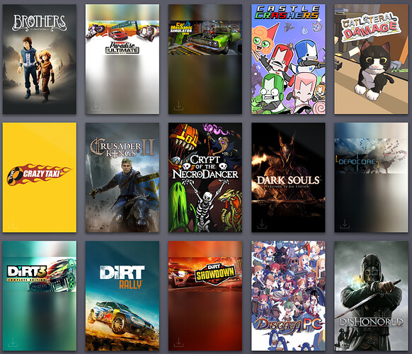
I dislike the fact that some artboxes/covers still do not fit the new view (aesthetics).
I do not like the fact that, with shared library, we have absolutely no option to view just our own games.
I’m confused as to why Small Mode was removed. I don’t need Large Mode for most of my Steam usage. Having a choice of both doesn’t seem harmful to me. Were there any plans to revamp Small Mode, so they’re removing it now to… Do something? (Yes, I’m using the command line arguments to force it to start in Small Mode, but this is a workaround and not a solution at all.)
Also, why is Invisible status removed from Friends? I noticed they didn’t remove it in the system tray icon context menu, but… What was wrong with Invisible status?
This revamp seems more like a forced Candidate-Release (past Beta), rather than continue to let people opt-in to the Beta until it’s actually polished and ready. My computer (not a potato) also seems to require more time to load graphical elements in with the new Large Mode UI (both Store/Library). I’m not quite on-board with this.
still there for me ![]() , steam is weird
, steam is weird ![]()
What the?! When, how, why… At what point did it suddenly return without notice? I didn’t get any patch update or anything! I swear I lost the option to go Invisible, and yet I see it now! Does VALVe do A-B testing in Steam? No, right?
From what I remember that was only an issue in one of the earliest builds of the public beta, it was re-enabled in the first few days several weeks ago.
Nope, it’s just shit.
Welcome to the new Steam library!
I’m with you and I think @Fraggles is nuts on this one lmao
That’s just you two failing to understand my point of view. As I said I tried sorting into categories when they were first introduced many years ago and whether I was mistaken at the time or it was fixed later I came to the understanding that multi-selection was not possible. I did not try that again until this new iteration of the UI and was delighted with the possibility, having not been aware that it’s been possible for a long time.
Nah, I feel you, I’m just messing. Wondering if they could keep the old functionality as well as the drag-in-drop they have now. Fingers crossed.
What I want to know is why transparency in game icons isn’t displayed correctly, even for Valve’s own games.
I had the bulk of my library in Categories before the changes. Mind, I have to do some more sorting and having tried yet, but seeing all my categories neatly arranged and easy to pick from - I like.
Must see it works as good as it looks myself.
If you are like me and hate when the Steam Grid pictures aren’t properly sized like so:
Good news! you can fix that! Right click the game and find “Set Custom Artwork” and select the file you wish to use. Common size is 600x900, but I think steam scales it. And good news, if you wander on over to Grids - SteamGridDB you can just search for your game and download one that is already made.
There is also a sub reddit:
Steamgrid also has animated ones as well if you wish to add one.
Here is a list someone compiled:
Here are some guides for those savvy enough to make them:
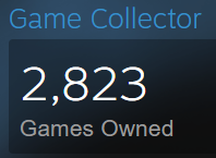
Right, let me just go through the 3k games in my library and manually set custom art for each and everyone of the misfit icons.
Sounds to me like it doesn’t bother you enough then.
I would rather have the information available to people who it bothers a lot and are willing to put in the time to fix it, as it’s been long enough from the update that the developers/steam are not likely to do so.
I feel you 
 I can’t even get myself to organize my music.
Nar, ain’t updating them all manually. Now, if some kind soul should make a script or app to do them all automatically, I’d be forever in their debt.

I’m willing to get games into categories, but thumbnails? Herm. Maybe, it bothers me too, but moreso in the GoG Galaxy interface.


