Well, don’t have a TV. My beef is that it looks like I have to use it to get to use my controller. Just really don’t like the UI, no biggie.
It’s only sole purpose is TV + controller  I guess If your Monitor/s is/are big enough you can sit back and relax when you will switch some games around in short time and can’t be arsed to use the M+K and just the controller, but other than that - no purpose for plain PC set up.
Got it. Steam is just usually fretful with me and controllers. My bestie surprised me with a new one a few days ago, so I’ll see if things work out without big picture. Still can’t get over it.  Great surprise.
i dont like the new steam but the old is so 2004
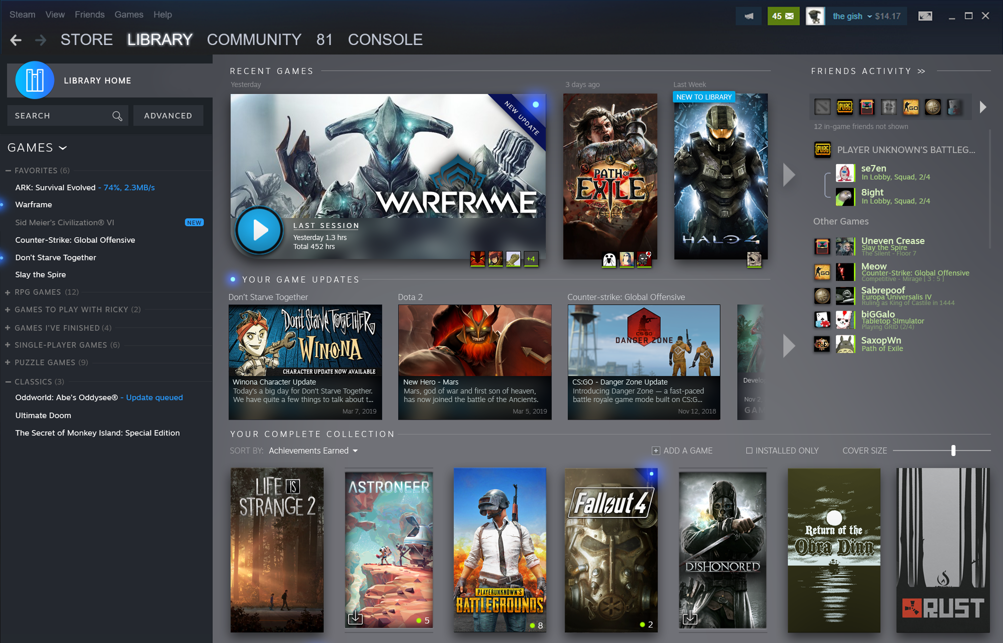
yea i was referring to the screenshot in the article for the upcoming changes in X month, not something that’s already been updated 

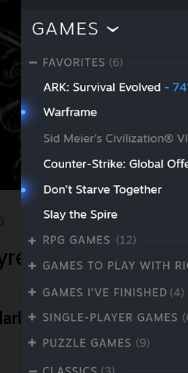
look at those annoying blue notification lights on the left side of x game 
-even a shiny blue “new” light for a non-installed game 
hell even the new giant blue library home icon annoys me, not just the ridiculous blue lights (on the right side/on “games overview” page)

so much clutter and needless stuff there it just screams poor and wasteful annoying ui (imo) compared to the sleak “black” and mostly empty library page atm
y not sure i see anything that i like here either, i only ever go in my library to choose one of my installed games (i use favorites for uninstalled games that i still mean to play later) and hit that play button or occasionally look at achievements and that’s it; not sure i wont be very annoyed by these changes here
Its has finally been announced that it will be hitting Open Beta Sept 17th.
Endless griping on the horizon then. I’m not a fan of change myself and this news makes me a little nervous. It doesn’t really help that historically every damn UI redesign by pretty much every single company for the past 15 years has been for the worse, some catastrophically so.
But I guess I’ll try it out and hope for the best.
I don’t like the changes we have now. I liked the simplistic UI we had before. Making it more and more complicated in hopes of making it look like a mobile UI isn’t for the best. It is just annoying to navigate and is always—always—ugly to look at.
I hate all of this and want it dead.
I don’t like change.
but it could be worse I guess…
It doesn’t look that bad to be honest given the images they’ve shown it pretty much looks like GOG Galaxy 2.0.
At first glance I was like, why did they make this UI confusing and unruly. But, honestly at a second glance it doesn’t look that bad. I still feel they should keep the UI the same. There’s really no reason to change it since it has been working perfectly fine.
I agree with @Gnuffi here.
But, it is unlikely they will give you the option sadly. If they do give the option, that would be awesome. Then everyone wins. Those that like the changes, can keep the new UI. While those who absolutely loathe the new UI can revert to the old UI. I wonder if there is a way to save the old UI somehow. ![]() But, in all honesty it shouldn’t have to come to that.
But, in all honesty it shouldn’t have to come to that.
Wonder how it’s gonna interact with steam skins. I’ve been using metro for steam which is nice.
it’ll most likely break them.
Never even thought about changing the skin for steam. This is totally new to me and awesome! Mind. Blown. 
I use the air skin which made the old UI look far better. I really hope I can still use it otherwise most likely i will just use gog galaxy 2.0
I also dislike GOG 2.0 lmao
At least I hope it’s well optimized or someone finds a way to roll back if one wishes to.
the open beta is now live.
The question is can you leave the beta if you try it?