So I need your help, guys.
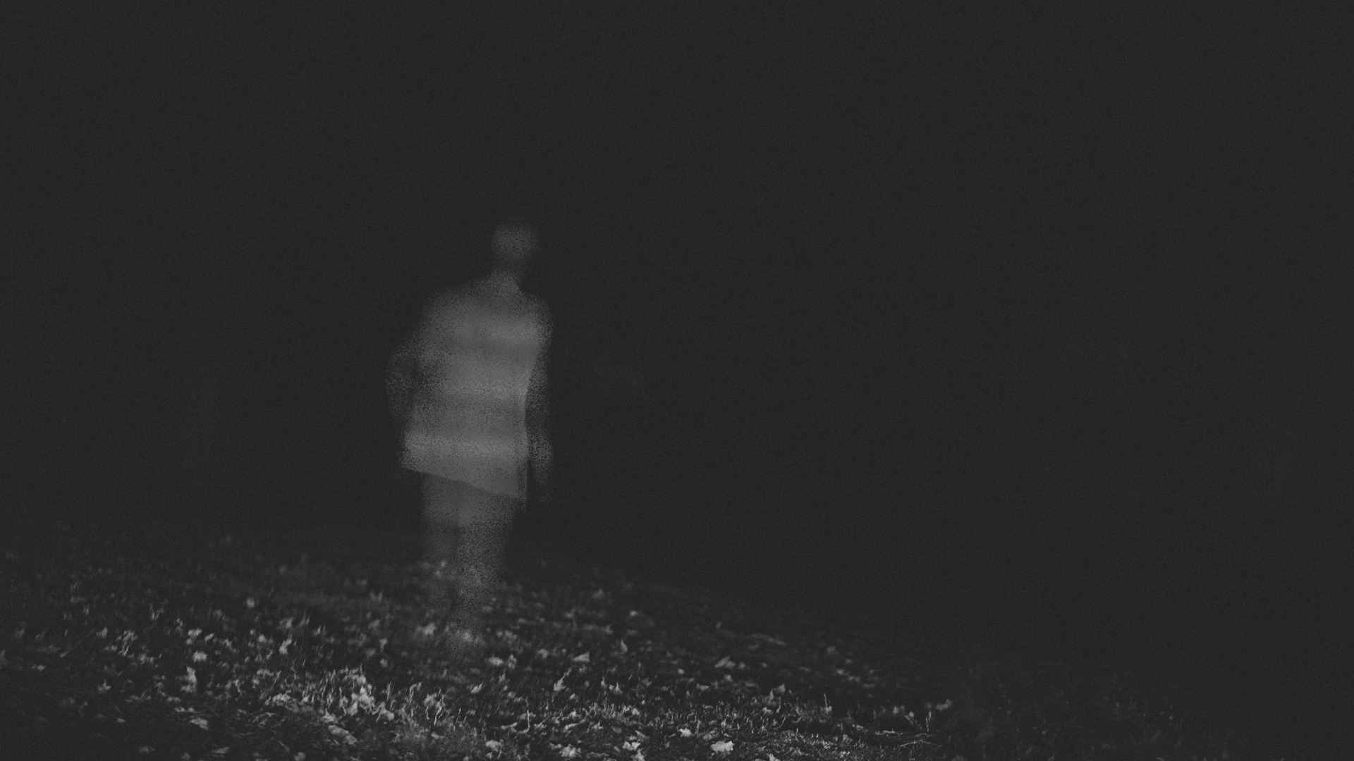
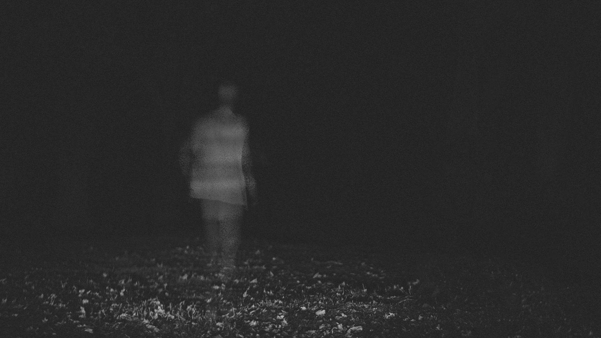
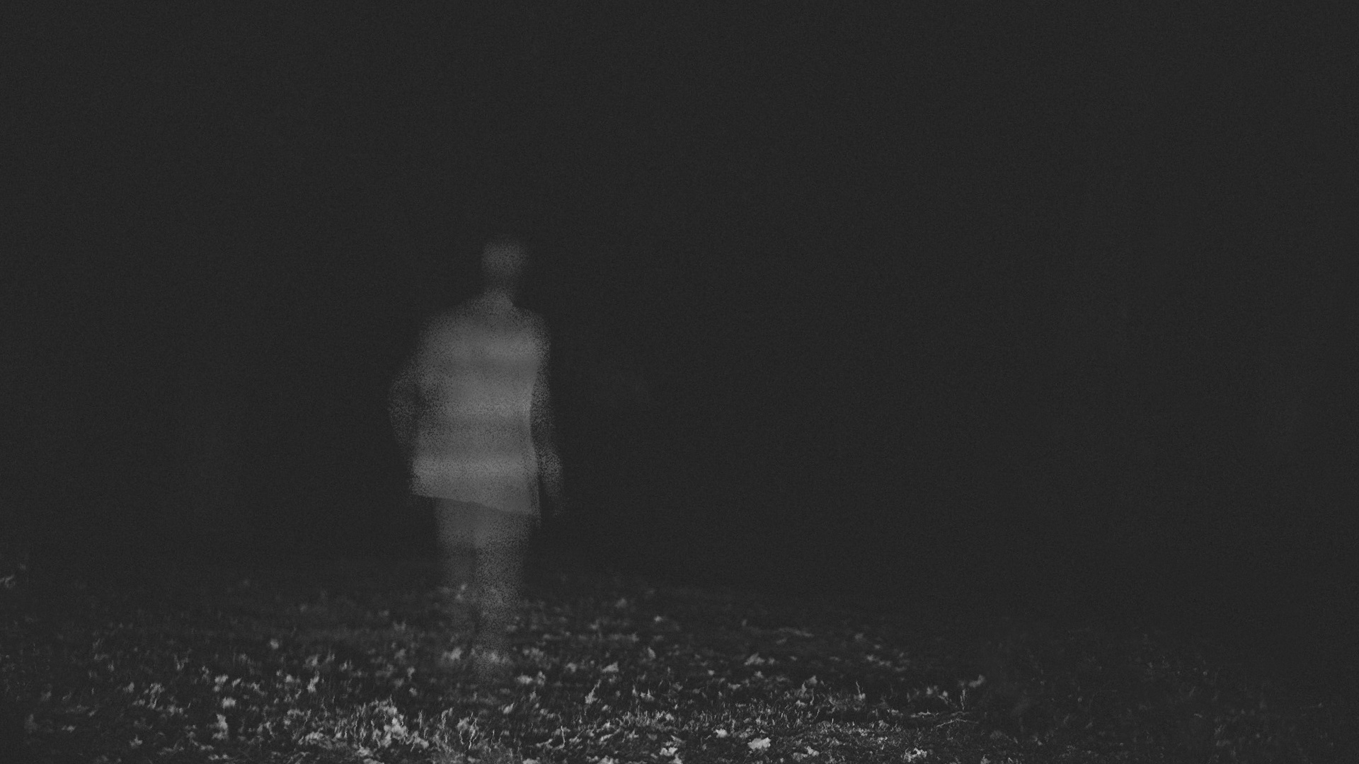
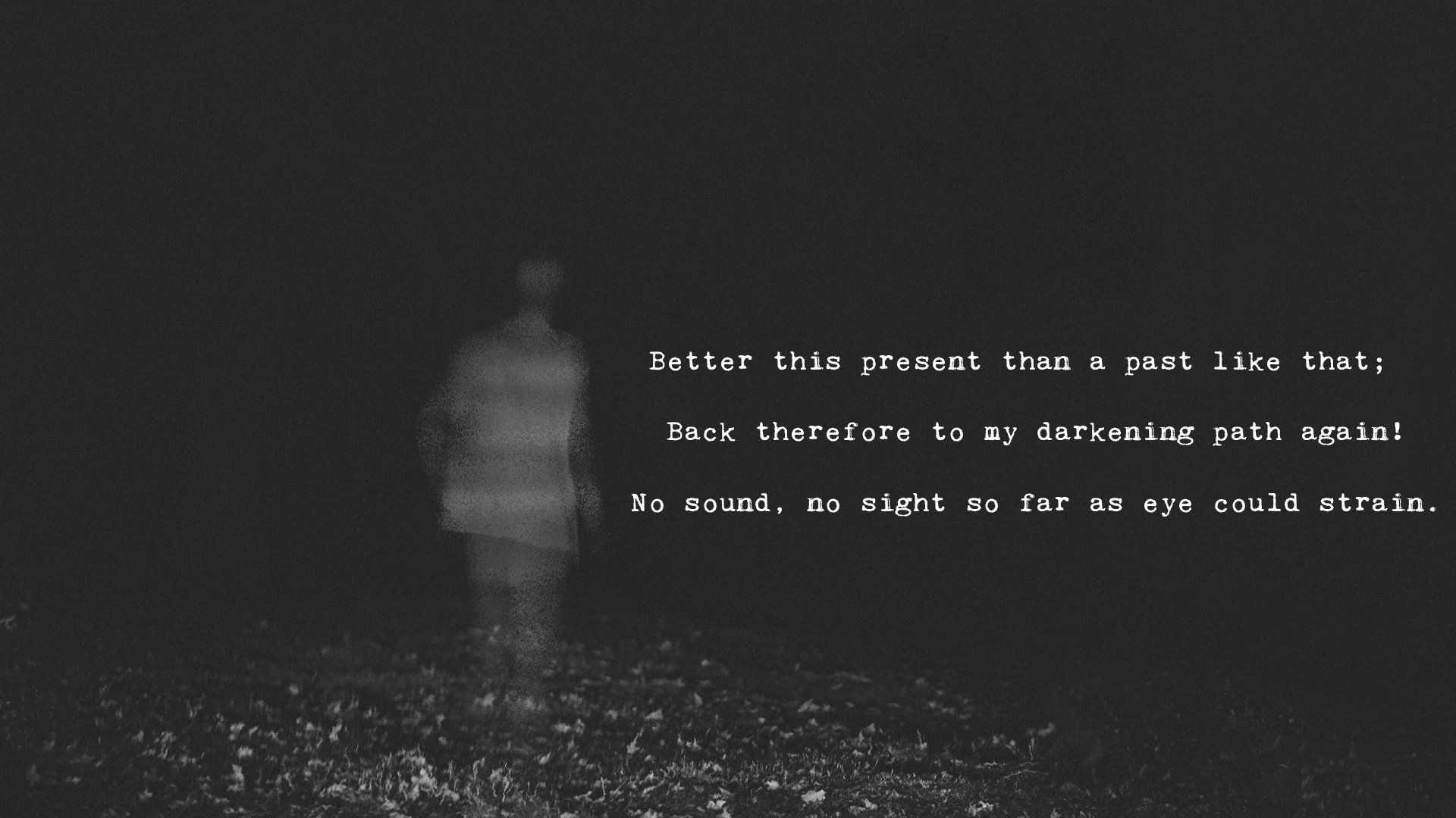
I’ve got 3 versions of an image I’m working on (for TTDT), and can’t decide which one is better:
They’re pretty similar, and I can’t decide which would work best to convey these lines:

Which one do you guys prefer?
9 Likes
Honestly, besides being cut differently, they look identical to me.
I’d go for Nr 3
1 is too…sloping? you know what I mean?
2 is so perfectly centered on the person that it basically looks like a pic someone took having a lot of time on his hands, which imo doesn’t make sense with that kind of ghosty pic.
10 Likes
I like 3 too. It’s a bit clearer but still fading, dark, gloomy and scary looking.
5 Likes
Number 1 for sure… exactly because of the slope and addressing past and present, being darkening path, yet again. I kinda get the feel for a descent, so it’s way more fitting.
Throw a bit more “light” on the trees though, just so you can kinda make them more part of it… now they are like “reversed shadows”.
7 Likes
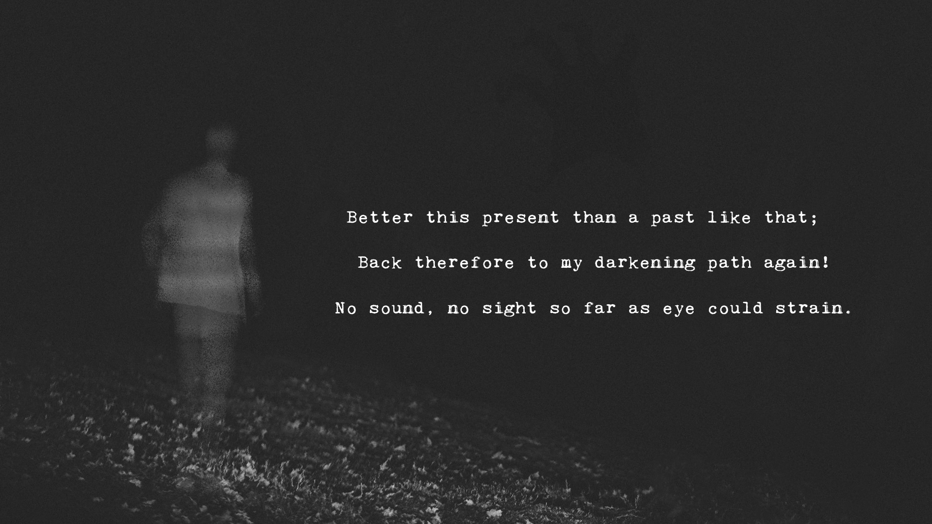
Agree with @onLooSe, sloping seems to have additional meaning. But body posture is usually still upright on a slope, and I think that’s why it looks weird. Could you take the sloping background and apply the upright foreground image and see if that looks okay?
9 Likes
Well he is leaning on his right leg because of the slope … the posture looks natural for me  . If he had a bend in the knee… he shouldn’t be slanted though… but no bend = perfectly fine
5 Likes
I think with the two legs close together it looks like the person could topple, I would do a half stride apart with the two legs, to indicate the clearly distinguishable elevations of the left and right feet, showing slight action in the leg, but keeping the torso upright.
5 Likes
The left leg is in forward position from what I can see … so it’s a whole feet forward (american measurements coming handy this one time in my life!  ) which kinda makes it normal for him to dip a shoulder even more when walking on such a slope.
I spammed enough already in this thread
4 Likes
But then again he’s a ghost… lol… I have spammed enough too. 
5 Likes
Last one but … I feel it’s required - In every movie I’ve seen, ghosts follow the terrain
4 Likes
Hmm, I’m thinking either 1 or 2 personally.
6 Likes
great… so I’ve been recommended literally every option… 
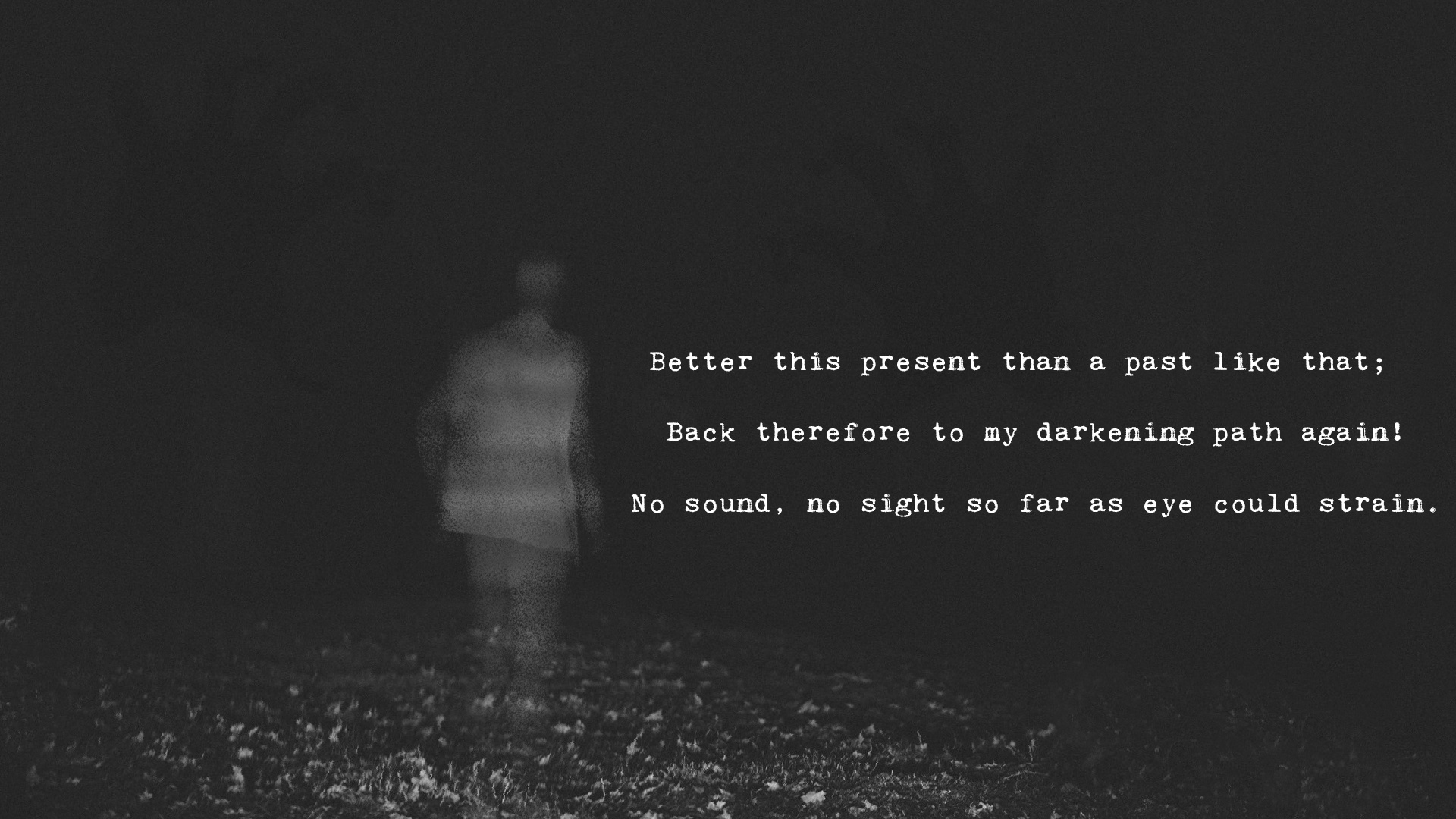
Here’s an idea that takes the whole thing in a slightly different direction:
@YQMaoski @onLooSe don’t worry about spamming—hearing other’s thought processes is really insightful to me
9 Likes
Only the right hand and a bit above the text.
4 Likes
as in… the one on the left side of the picture?
4 Likes
Sorry, had to do it to you. It seems basically imperceptible, so I couldn’t really describe it, but there’s something about 2 that speaks to me.
5 Likes
The one in the right side so you can get clear composition… currently your model is in the left side… thext on the right… the model draws first attention and then you have the text. You want people to notice the hand trying to grab him (above the text) while they are starting to read and so it can be seen clearly.
Balance is pretty important where you want to focus attention. If you leave both you are really leaning to the left side composition wise and doesn’t look balanced.
5 Likes
and now just move the model + the text and the hand slightly to the left and you should be fine .
Also highlight the trees a bit more. Btw I studied architecture and composition was like 2 years of my education. You need to balance the interest points so your art doesn’t “weight” in particular direction of the photo or whatever you are doing.
4 Likes
that does look nicer I think…
6 Likes
I was using the “dark interface”. I went into my settings and tried the light one…and 1 seems a bit better…but I still like 3 better…but I didn’t go to art school or anything…
(Sorry didn’t mean to make it seem it changed anything…it didn’t. ) Just the white and then black pic made No. 3 clearer(which I guess you Do NOT want…lol). I did the zoom too.
5 Likes