I think @onLooSe is still indicating the hand should be closer to him…
5 Likes

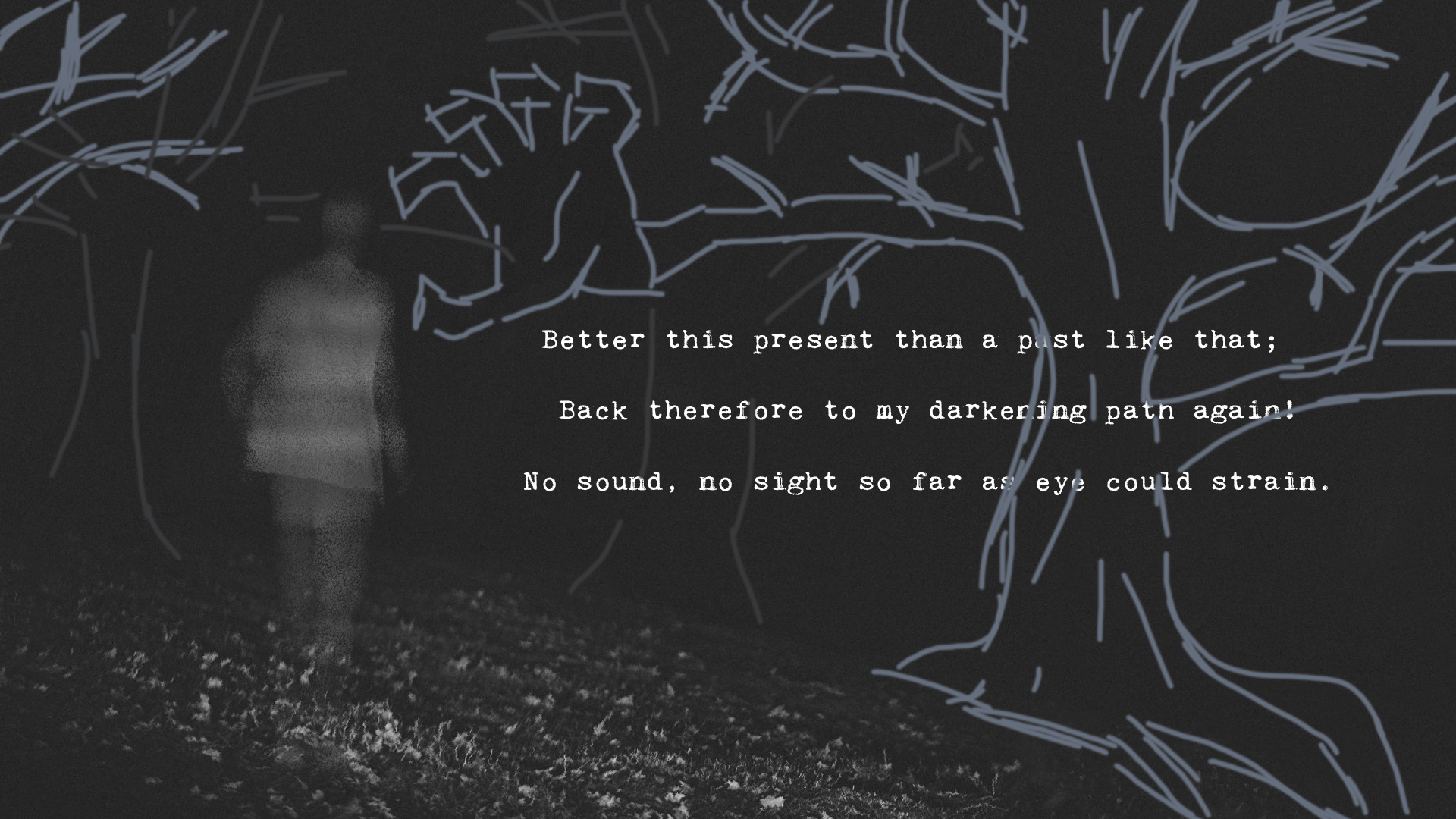
It’s perfect but the trees gave it a bit of artistic grim nature … you can go just a little bit with dark grey contouring them like there’s light in their direction (highlighting their contours). Trees are creepy when they are almost pitch black and I guess that’s what you are going for - be brave with them!
4 Likes
I’m using the dark theme… If I switch to white it will change the whole picture? I checked them all at full screen … should that make a difference?!
Nah… it doesn’t change anything… just checked 
4 Likes
I went out of my way trying to fill the scene by still keeping the creepy theme in mind and what not by using just a paint brush and mouse in photoshop (unfortunately I don’t have tablet at home) but it’s mainly idea concept … so it’s just a few lines here and there ;]. If you don’t tie the hand to the trees, I still think you kinda want to have trees The big one on the right kinda balances everything on the left anyway. (just an idea and recommendation - don’t forget) This is just a sketch after all of course! Shouldn’t look anything like it … just the positioning
5 Likes
@yitzilitt A quote that comes to mind:
“A book read by a thousand different people is a thousand different books.” ― Andrei Tarkovsky
That applies to your images as well. As long as you keep this open for suggestions, you’ll keep getting different suggestions, singular in each one of their views.
Coffee or tea?
“I like coffee, but only without sugar.” “Tea is excellent, with or without milk!” “Personally, neither. Water is the one true drink.” “Nothing beats a cold beer.”
And so and so on.
I get you appreciate listening to other people’s thoughts, but I’m not sure how much we can decide for you what looks best. Ultimately, it’s your choice, man. It’s about what you like best.
It’s tempted to share what I think but I won’t, goes against what I’m preaching and that’s just silly haha
8 Likes
Of course; at the end of the day it’s my decision to make. I do think hearing others views can help one’s art process tho—people think in different ways, and it’s insightful to see my art from someone else’s perspective
6 Likes
It’s a different mood than what I’m going for, but that definitely looks super cool 
For now I think I’ll stick with the super subtle background tho
7 Likes
In my opinion, I think the first image (even with the slope) better conveys a ‘weighty darkness’. I can’t speak to if the text takes away from that effect or not, but figured I would put my 2 cents in.
Could you maybe reduce the brightness of the text just a hair?
6 Likes
Sometimes your mind get occluded with your own ideas, when I’m not sure of my drawing or when I feel something is missing, I ask, and most of times I will get suggestions that, if well I won’t implement to the letter, usually will spark that bit of me brain where I’ll go “that’s a neat idea, let’s see how it goes”, just my two scents.
6 Likes
is that a fart joke?
I know it isn’t; i’m just having fun with a proofreading joke
5 Likes
I can barely tell the difference between the three images…given how similar they are I’m not sure that it makes much impact which you pick.
4 Likes
2nd one looks the best to me but the 3rd one does make more sense, especially if it’s not suppose to a clear steady image
3 Likes
the 1st to 2nd one does have quite the noticeable change but i can see how the 2nd and 3rd one is more subtle in it change
3 Likes
first one looks like he is in knee deep water
second one looks like he is on a meadow full of flowers
third one feels like he is going into nothing, so i guess third one fits the quote the most
3 Likes