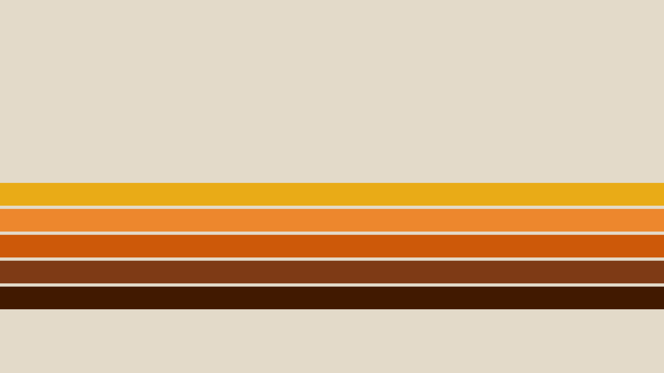
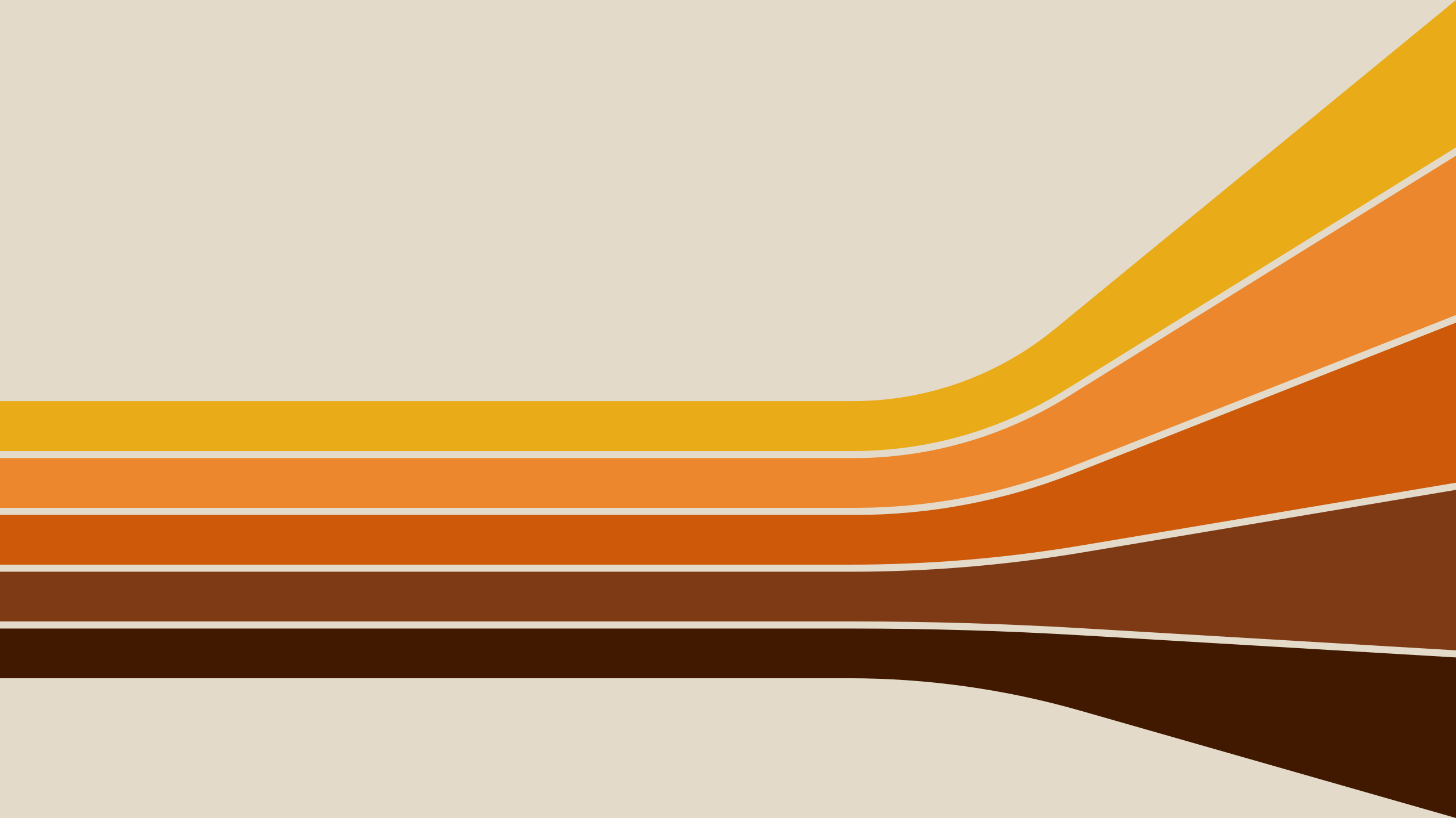
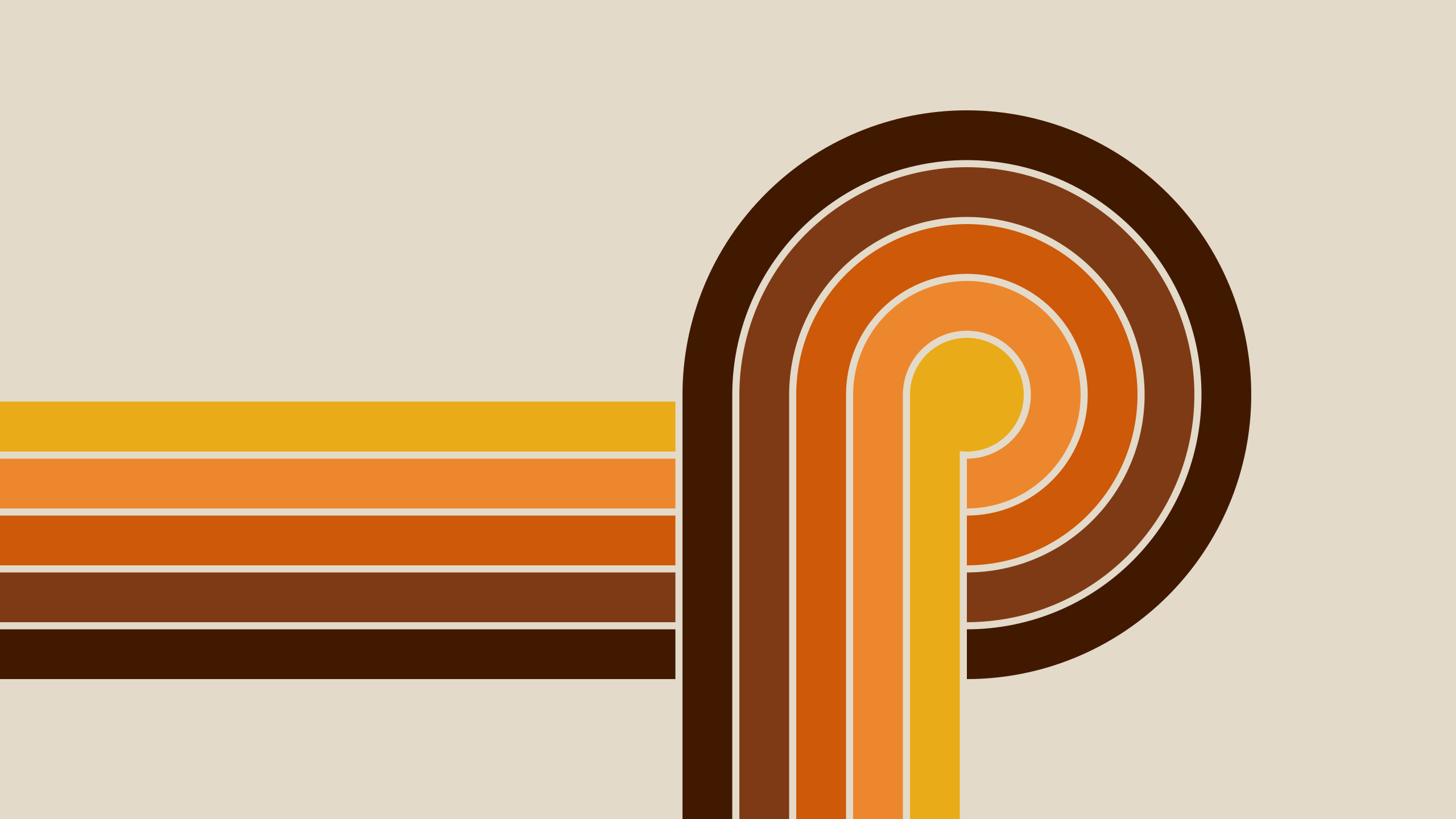
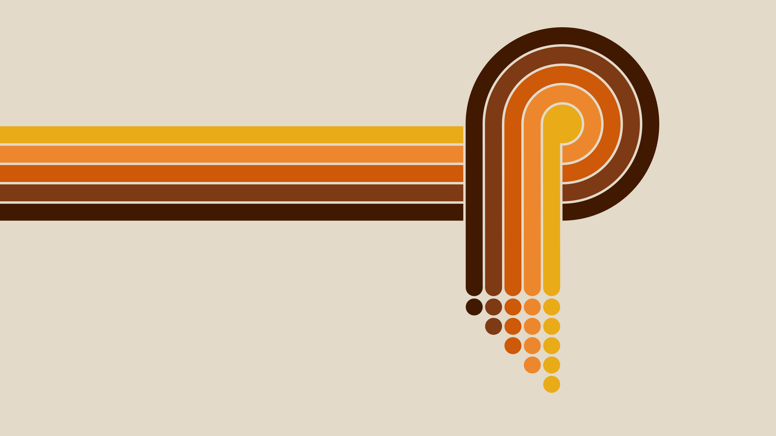
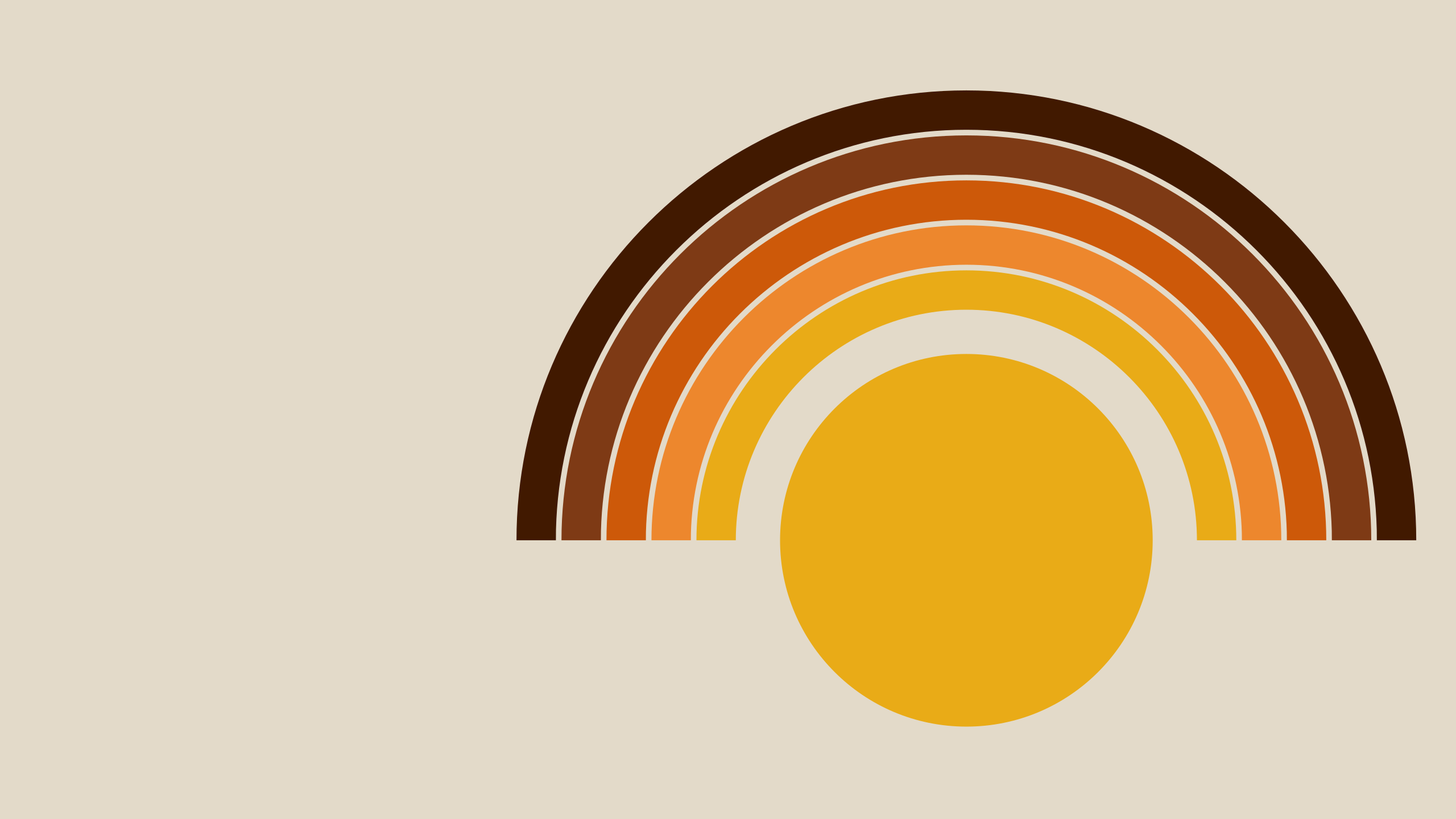
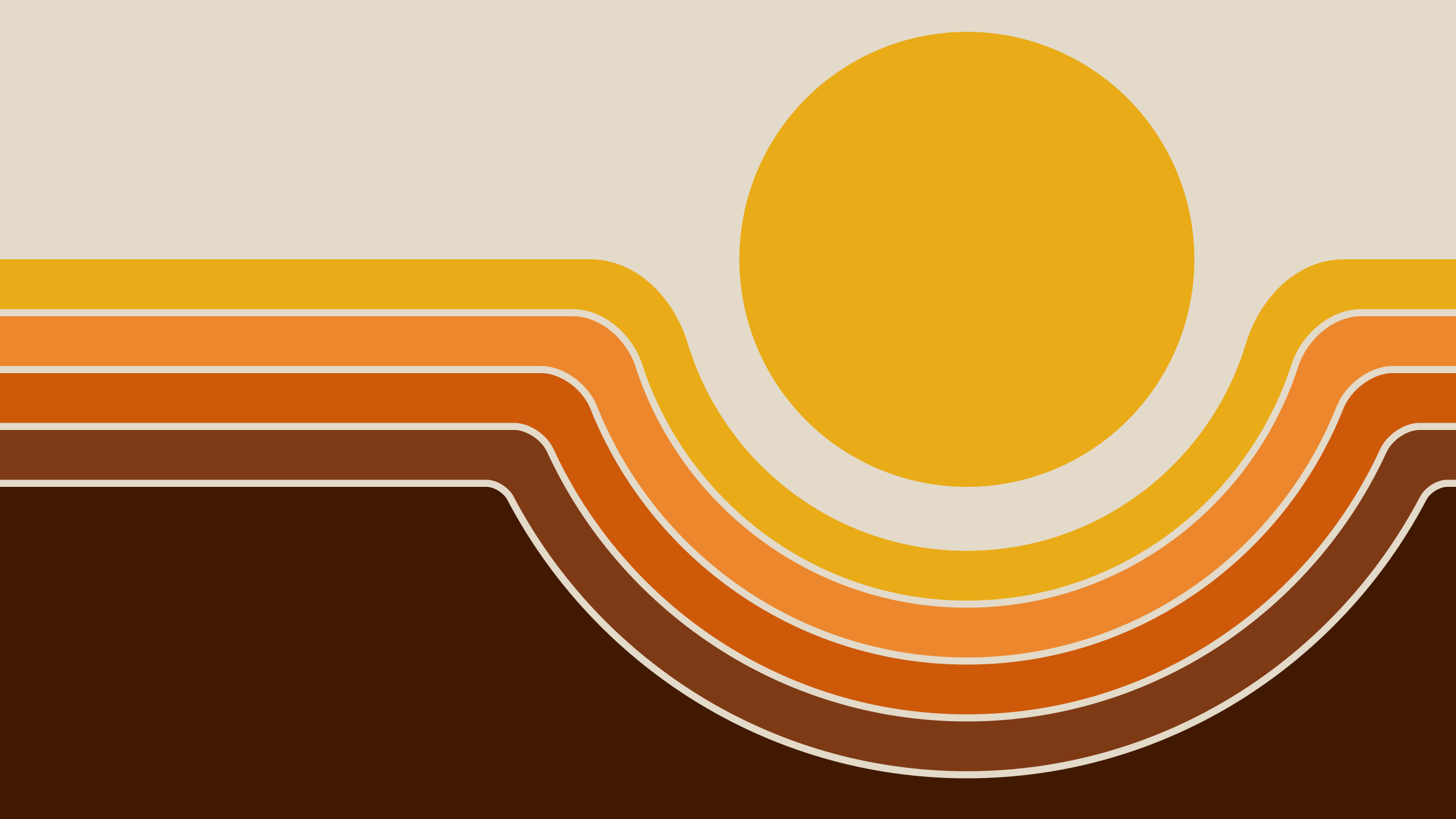
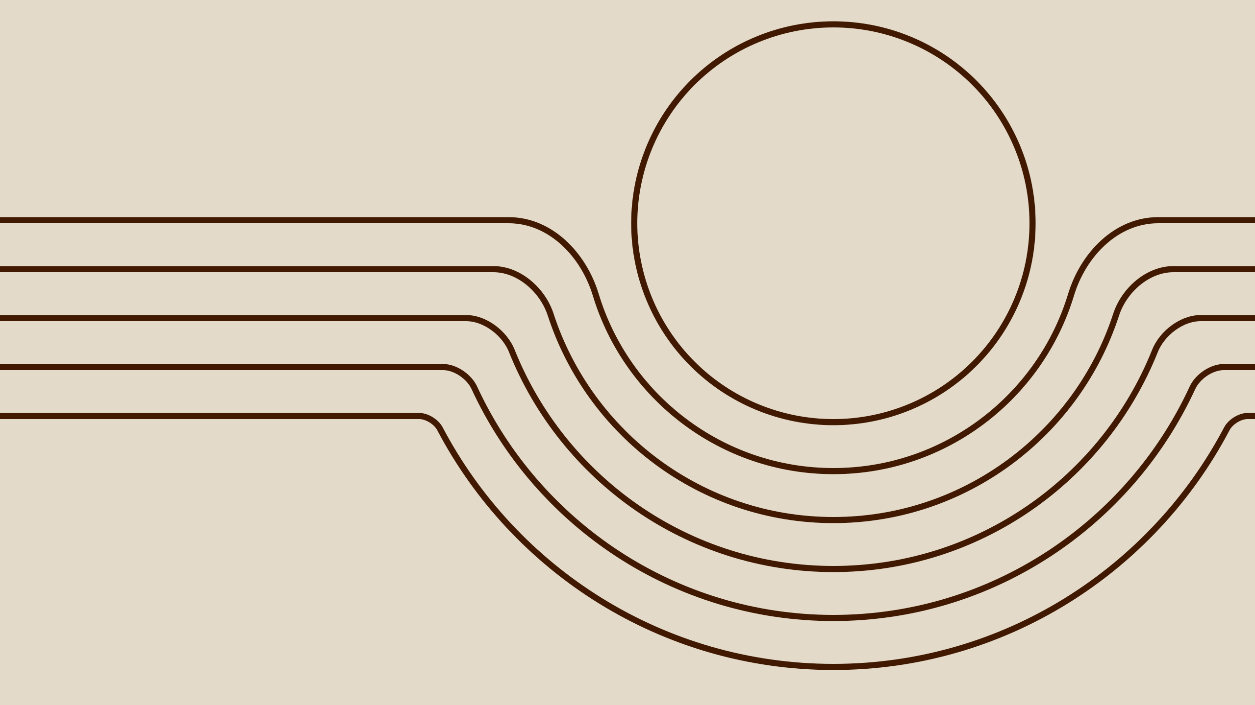
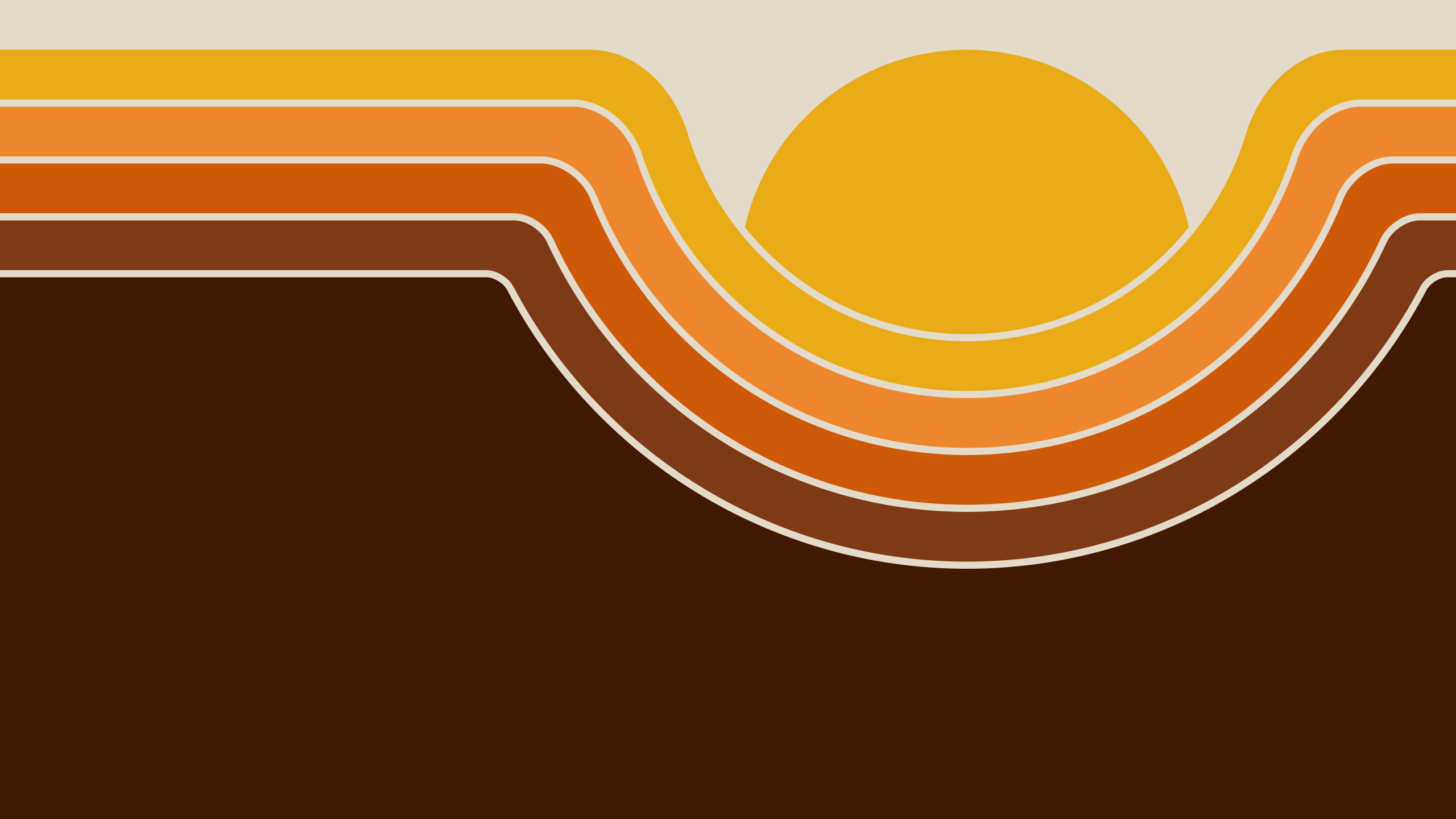
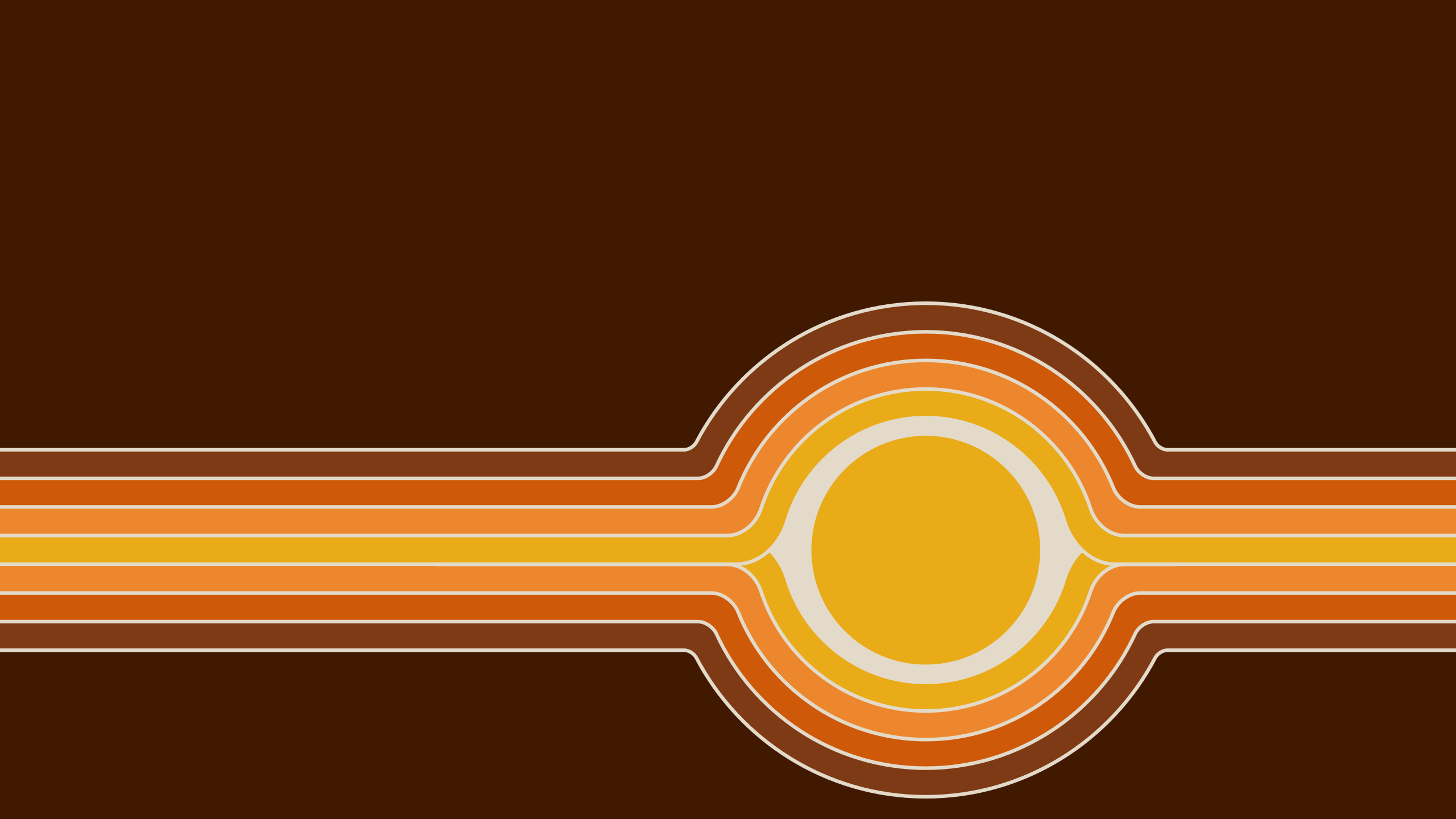
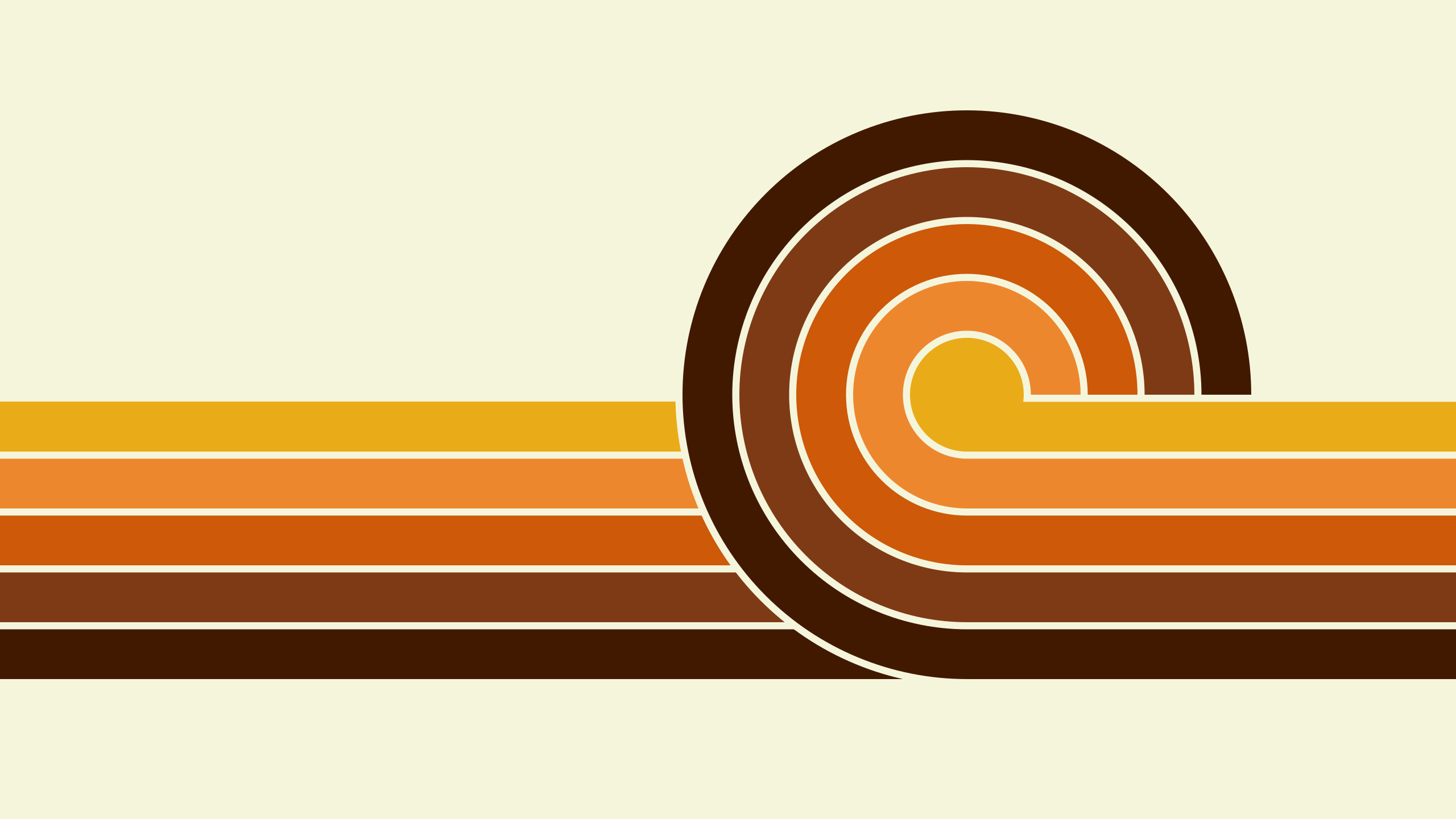
Been getting really into late 70s art lately (especially the orange stuff) and was wondering how to make those neat parallel-line drawings that were big at the time. After a couple of false starts I landed on vector art, which I knew about but had no experience with. I spent some time learning Inkscape and came up with some fun wallpapers. Thought you all might enjoy a sampling of my favorites!
Anyone else like playing with vector art?
13 Likes
these look cool!
i thought vector drawings were good for scaling the image to any size and not having resolution issues so does it have a benefit for wallpapers which are static and a fixed size? or does it help in the creation process as well?
4 Likes
Thanks =)
As to the creation process, I guess it kind of depends. Each of those wallpapers could have been made in a raster environment. That probably would have been faster for me, since I had to learn an entirely new application, and I did have to spend a lot of time playing around and familiarizing myself with vectors. That said, I do enjoy graphic design so this was as good a vehicle as any for me to learn Inkscape. And once in there, yes, definitely there are advantages.
I would say the first benefit is that by creating the art in a vector environment, it can be scaled to wallpapers of various sizes. Each exported wallpaper is a raster image, but the source will allow for various exports without artifacts from scaling up or down.
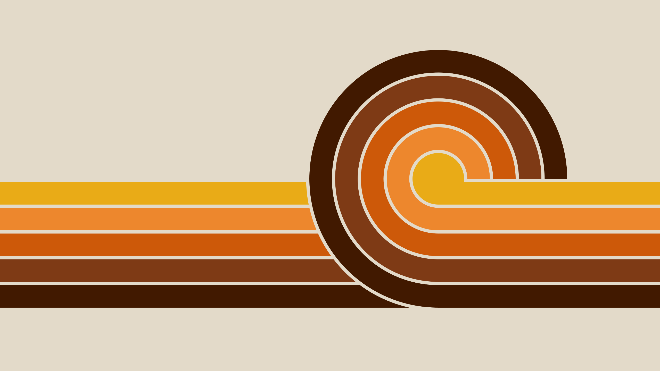
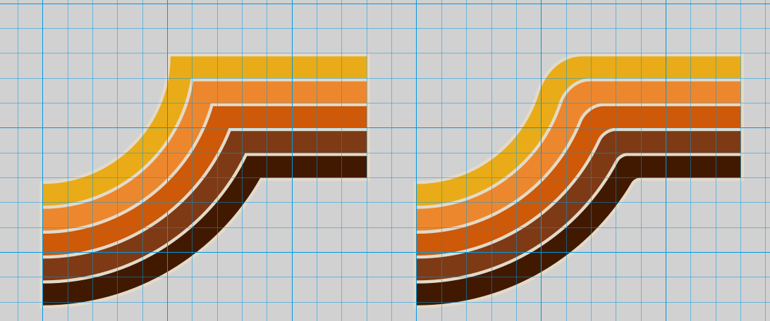
The second is a bit harder to explain if you’re just used to raster art. But since vectors are just points with properties, there are a lot of operations that are simplified by doing things this way. For example, in the sunset wallpaper above, notice that the lines are curved going into the dip. Using vectors, all I had to do to get those curves was to just define a curvature for those corners. I feel like that would have been a much more painful operation in a raster program.
5 Likes
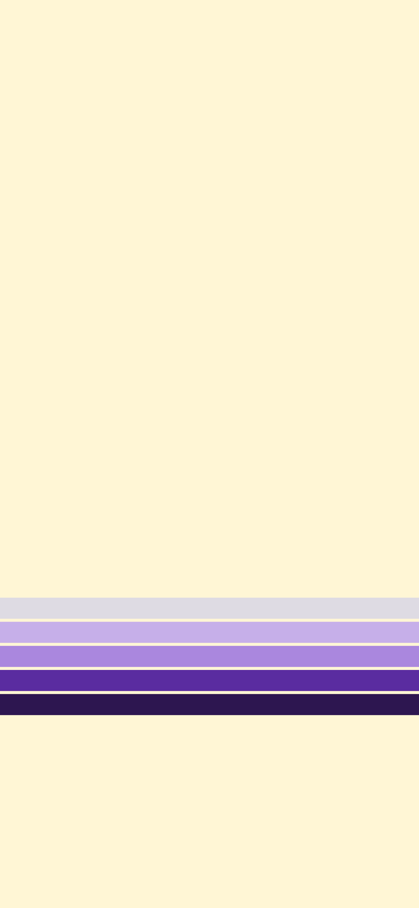
These look cool, but would look more accurate with an beige background.
3 Likes
Being vector art, it’s trivially easy to change the colors but… do you really think so? I’m a huge fan of beige (it’s my coding background color of choice) but here I think it’s too green for the color palette.
Original (Bone):
Beige:
4 Likes
It was mostly a joke based on the 70s theme, personally im not that fon of too many white shades on screens. But youn are right, the bone one does look better.
4 Likes
I just figured you were viewing in dark mode and your brain adjusted the bone to look white XD
White shades on screens are indeed hard - they are both very sensitive to color adjustment (intentional and otherwise) on monitors and are very “shifty”, being perceived as different colors depending strongly on context. Beige doesn’t normally look green at all to me, but next to this palette it’s practically key lime.
3 Likes
Random update, been learning a lot with Inkscape. I’ve always enjoyed graphic design but it’s clear to me that doing it with vectors is really the right way to do it. A smattering of samples:
7 Likes
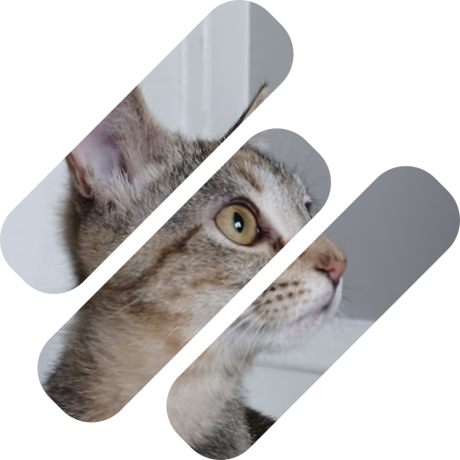
@delenn13 I knew I could hook you in with pictures of my babies =)
4 Likes
Just wanted to pipe back in and say I’m still really loving Inkscape and would definitely recommend it for anyone interested in scalable or clean art. When I was doing this kind of work in Gimp it was way more laborious because you have to work at super high resolutions to get good results at scale.
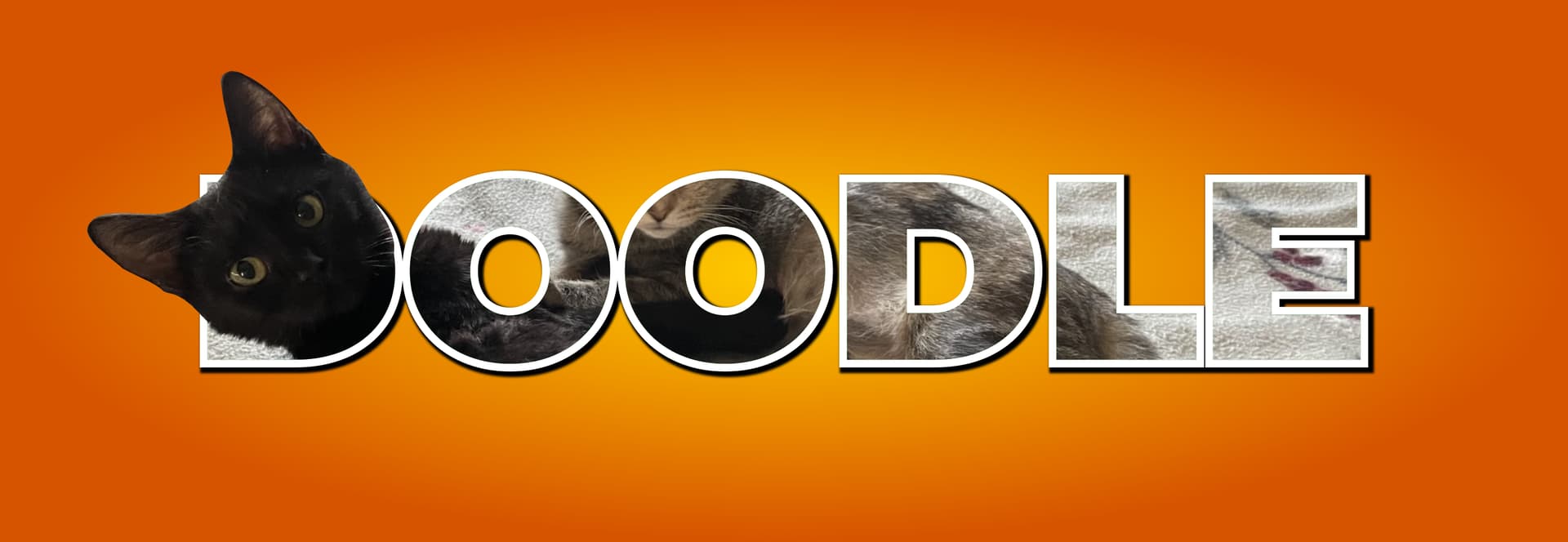
Gave the website a makeover while I was feeling enthusiastic - I hope you like orange XD
3 Likes
Nice page but I am partial to blues…
3 Likes
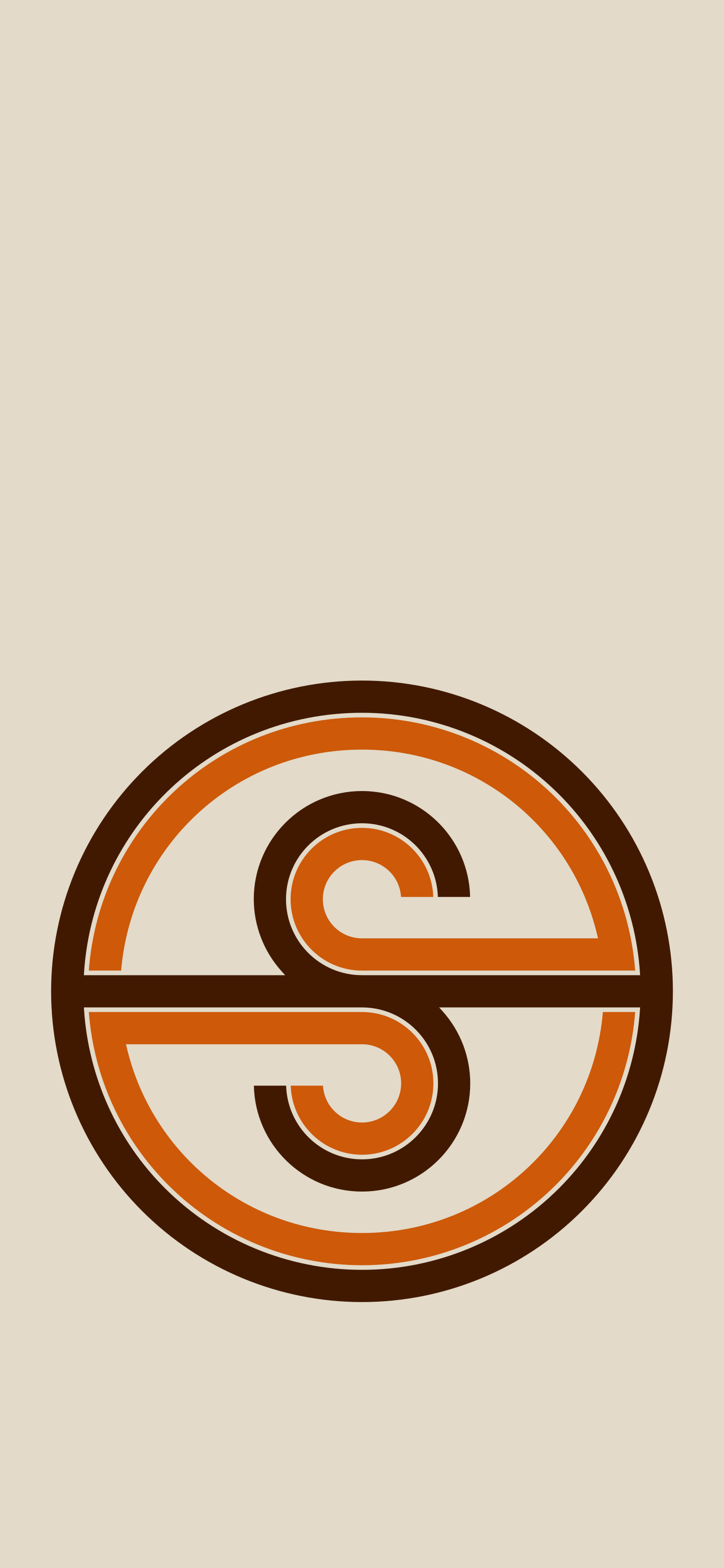
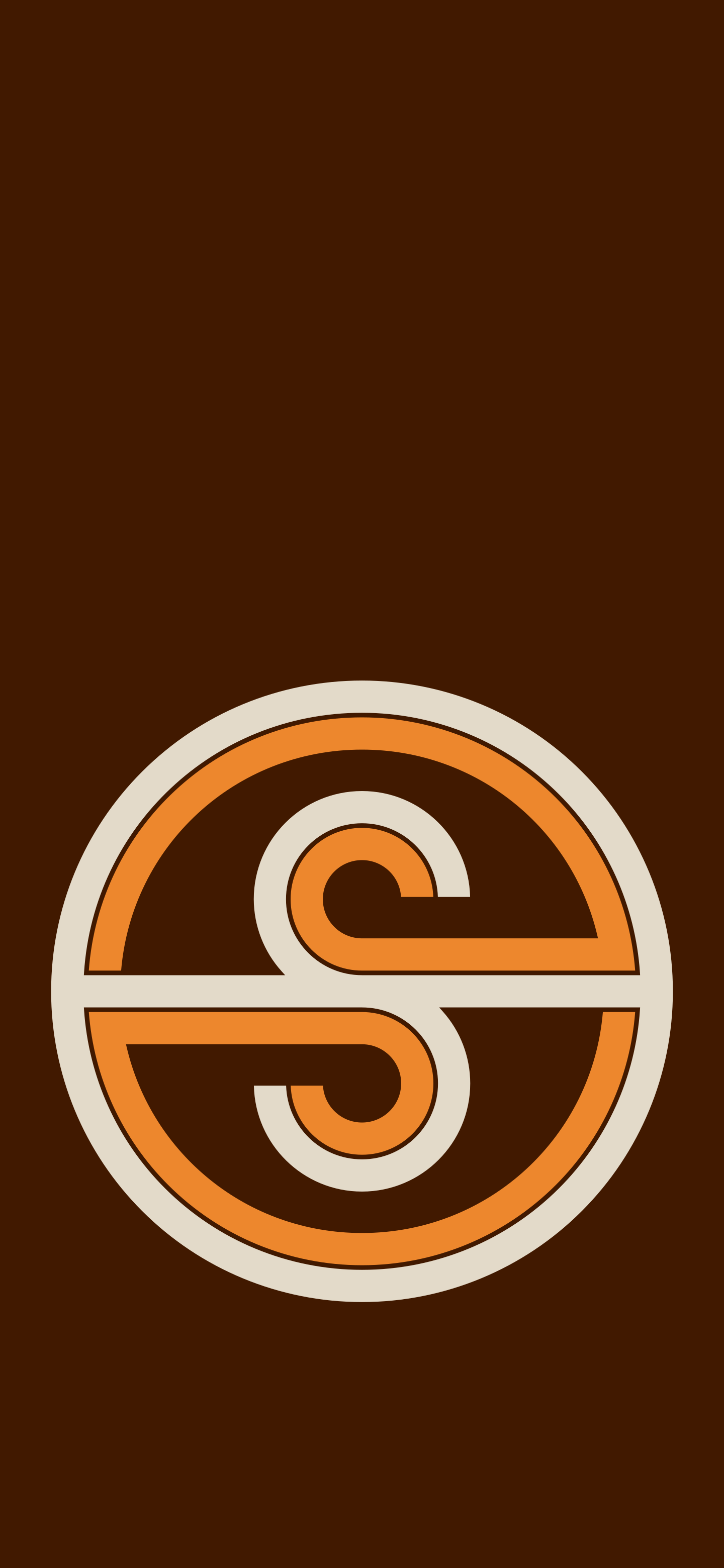
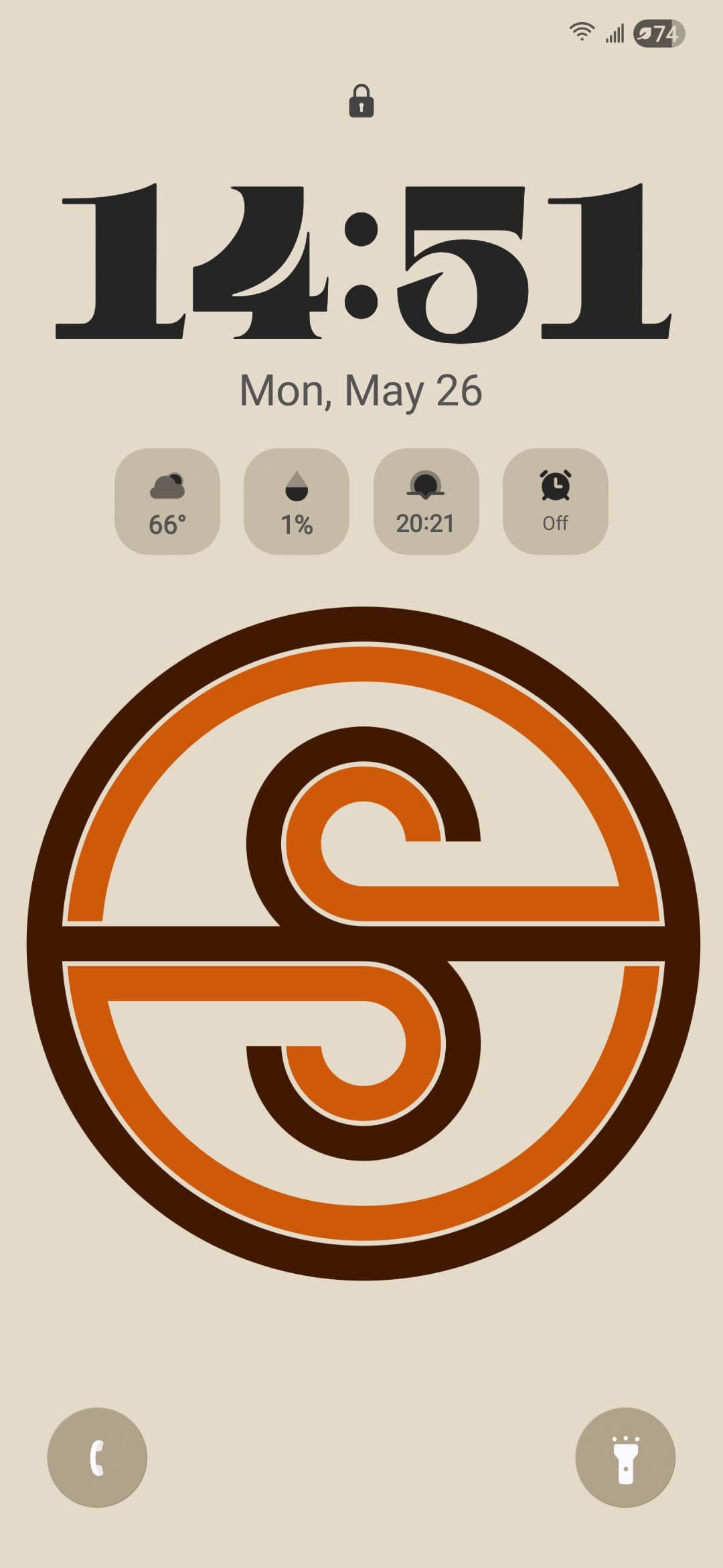
Just made some new phone wallpapers for me and the wife using our logos and color palettes: lock screen, home screen, light mode, dark mode. Obviously our logos are our logos, but I thought someone else might like the home screen wallpapers so here they all are:
(PS: my daytime lock screen in action)
6 Likes