When my eyesight started getting noticeably worse, I started paying a lot more attention to “visual ergonomics.” Monitor distance, height, angle, etc. That’s a whole other discussion, but today I’d like to share some thoughts on colors to point anyone interested in the right direction, and perhaps save you some research time. Particularly with the rising popularity of dark/night color schemes.
We all read a lot of text on our screens. Any many of get headaches and eye fatigue from doing so. Is there something we can do about that? If we can’t eliminate it entirely, is there something we can do to mitigate the effects of staring at a screen for hours on end?
The default way to read on a computer is dark text on a light background (positive polarity). You may have noticed a nearby programmer using light text on a dark background (negative polarity). If you code, you may have tried some darker colors yourself. Negative polarity is very trendy among people who look at a display for extended periods of time. There are reasons for that, but it’s not the answer for everyone. It does, however, tell us something important about why our eyes start to hurt when we look at a screen for a long time.
When your eyes face a computer screen, you’re staring at a light source. Your pupils contract, and like any muscle, can become fatigued. When someone uses a negative polarity color scheme with light text on a dark background, less overall light means a more relaxed pupil. So negative polarity is generally more comfortable over prolonged periods.
But negative polarity is not universally “better” for the eyes, especially for those with astigmatism. Astigmatism is an irregular curvature of the eye’s cornea or lens that results in image blur. Some reports estimate that 95% of the world’s population has some detectable amount of astigmatism, though in most people it is not severe enough to require glasses. If you have astigmatism, you may notice that negative polarity text is particularly fuzzy. One reason for this: a more relaxed pupil uses more of the cornea and lens, so irregularities in their shape are more pronounced (there’s actually a lot of science behind this phenomena, from point spread to spacial summation to the packing density of rods vs cones and their distribution on the retina… but it all adds up to worse focus in lower light, when the pupil is relaxed).
To put this into quantitative terms, a 1980 study by Bauer and Cavonius showed that participants recognized characters 26% more accurately with dark text on a light background. That’s fairly significant. Given the above, it should be no surprise that astronomers often view the night sky with inverted colors (black stars, asteroids, etc against white space).
Another factor is the “irradiation effect” noted by Hermann von Helmholtz, which in summary states that we observe dark objects on light backgrounds as smaller and more well-defined than light objects on dark backgrounds.
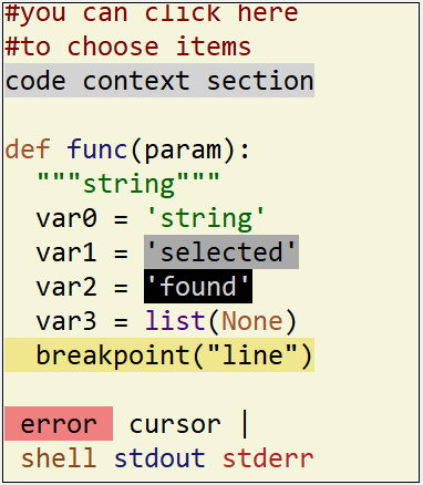
But a light background doesn’t have to mean white. Again regarding astigmatism, shorter wavelength (blue) light halates more than the others. So my preferred color scheme uses a tan-ish background. It works very well for me.
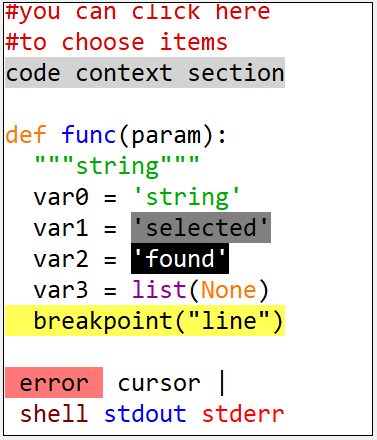
I do most of my coding in IDLE (a lot of people like to pooh-pooh idle, but IMHO if you need a fancy IDE to write your code, it’s not IDLE that needs to improve). The default light scheme looks like this:

And I find this to suite me quite well (I use the same colors where applicable for the command console, npp, etc):

There are a lot of websites and papers I could direct you to for further reading, but if you’re just going to pick one, this is a fairly in-depth, .edu scholarly explanation:
https://webvision.med.utah.edu/book/part-viii-psychophysics-of-vision/visual-acuity/#introduction
Anyway, I hope that helps at least a few people improve their visual experience. If you think you have a good color scheme, please share it!
