I did a search on the forum to see if this was answered, and I couldn’t find it. I also checked the FAQ just in case. What is the correct size for these images? I tried using an image that was 850px by 188px for my User Card Background, and it didn’t size properly (see below). I also tried 850px by 212.5px and that seemed to work, so maybe 1/4 ratio?
very good question actually
took me quite some fiddling, resizing and chopping to get mine somewhat where i wanted
because even if making a pic that is the “used default width” because of the auto centered thingamabob depending on height or whatever it can still change the image despite already being the 590px or 850px in width (and that confused the hell out of me for a long while lol)
I tried using a 4000px by 1000px (1/4 ratio), and it’s pretty sharp. The Profile Background didn’t work the same, but with the higher resolution, it’s also pretty sharp.
TL;DR
“Profile backgrounds will be centered and have a default width of 850px.”
“Expansion images will be centered and have a default width of 590px.”
“I’ve added some help text below the images now. It’s hard to specify dimensions as the vertical height can change, but I indicated it’s centered and the default width.”
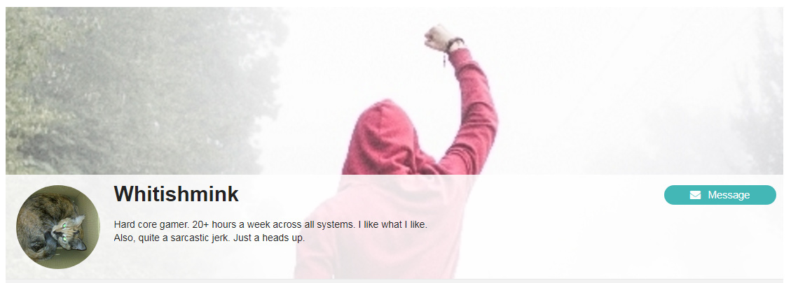
I too first tried to work with the suggested 850 width size, but with highly unsatisfactory results, so I experimented with the whole thing a bit, taking screen caps of the card and header as they appear in my browser and came to these conclusions
Header: 1110x390
Card: 580x280
and then I just said nevermind and tossed up a picture that didn’t conform to any of those dimensions but doesn’t really contain much of anything so it doesn’t matter.
I like them a lot too, but there isn’t a lot more going on along the edges than more snow and more trees. Nothing of the image is lost due to frivolous cropping.
Through clever use of subpixels clearly.
But of course since they’re split into 3 you’d need to involve at least 2 pixels and then light only 2 in one and 1 in the other to get the half pixel. It’s a rather tricky business.
